
The Evolution of NBA Shot Selection
The Evolution of NBA Shot Selection
When did centers start shooting threes?

How have players’s shot selection changed over time? Here, we break it down by position and look at shot distribution each year since 2000.
The question itself is fairly simple (and perhaps the results are not to useful or interesting). But we were drawn to the question because the subtleties required to build a model that can answer it. Specifically, how do you model an “average” point guards shot chart?
As an aside, this is a generic question I’ve been thinking about for a long time. Five years ago, I wrote an algorithm that found players with similar shot charts, which landed me an interview with the Pacers.
But going back to the original question, how can you model an “average” shot chart? Here, we’re using a dirichlet-multinomial model (see full model and details below) that learns how much each player shoots in each “zone” (e.g. 10-16 feet from the basket). One appealing aspect of the model is that it incorporates all players of each position, but if a player has only taken a handful of shots, it naturally does not let that player affect the model parameters too dramatically.
And as always, we are keeping track of the uncertainty in every aspect of our models. However, there is an overwhelming amount of data for each season, so our error bars are typically so small, you can’t even see them (except for the 2022 season).
Shot Selection Evolution
We’ll walk through each zone, starting from the 3PT line and working our way in.
Here’s our model’s of understanding of what fraction of shots each position takes behind the 3PT line.
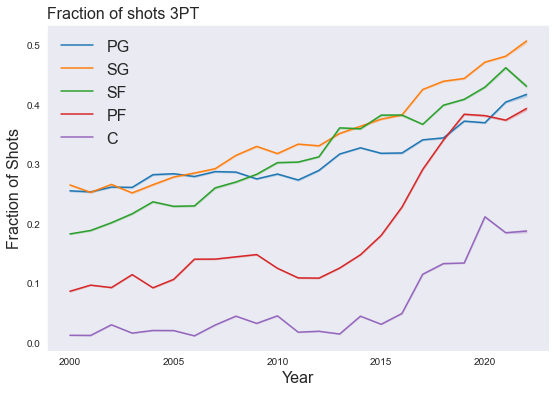
Probably the most notable part is the delay the big men show relative to smaller positions. Any predictions on where this will go in the future?
Here’s what fraction of shots each position shoots from 16 ft from the rim to the 3PT line.
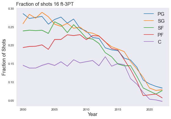
Note that the nosedive doesn’t start until around 2010, and compare that to what happens at 10-16 ft.
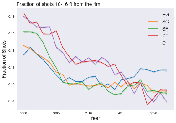
Another nose dive, but here it happens much sooner. Most positions leveled out, but maybe centers have some more work to do.
Closer to the hoop, it gets a little bit weird. Here’s 3-10 FT
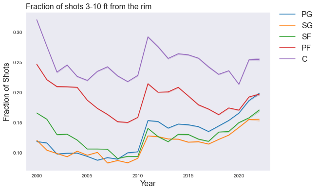
All smaller positions show a similar trend- tapering off from the early 2000’s until it started picking up in 2010. It’s worth noting the scale on the y-axis here. These changes are very small- it’s basically fluctuating between 10-15%.
And 0-3 FT.
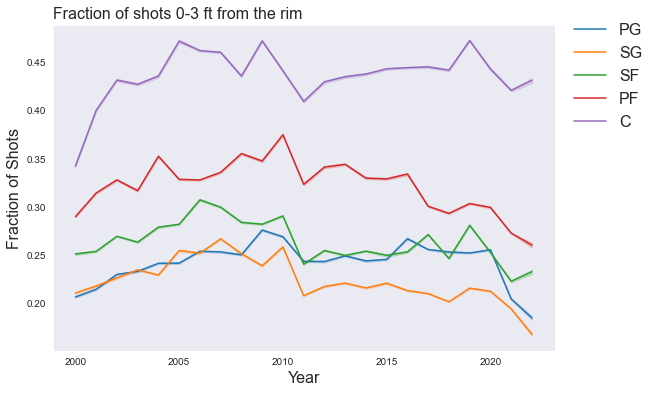
There’s not much to note here. Except that PG/SG tracked fairly similarly until diverting around 2008. In fact, the lack of notable changes is itself interesting- centers aren’t event taking more shots at the rim than they used to.
Model
This model is simple, but is one of my favorites. Inspired by skittles, I’m using a dirichlet-multinomial model. I recently learned that Stan can efficiently sample from unit simplexes (See this amazingly titled paper), so I’ve been stuffing these square models wherever I can find a round hole.
data {
    int<lower=0> num_players;
    int<lower=0, upper=5> pos[num_players];
    int zone_counts[num_players, 5];
}

parameters {
    // One simplex for each position
    simplex[5] zone_fraction_1;
    simplex[5] zone_fraction_2;
    simplex[5] zone_fraction_3;
    simplex[5] zone_fraction_4;
    simplex[5] zone_fraction_5;
}

model {
    zone_fraction_1 ~ dirichlet(rep_vector(10, 5));
    zone_fraction_2 ~ dirichlet(rep_vector(10, 5));
    zone_fraction_3 ~ dirichlet(rep_vector(10, 5));
    zone_fraction_4 ~ dirichlet(rep_vector(10, 5));
    zone_fraction_5 ~ dirichlet(rep_vector(10, 5));
      for(p in 1:num_players) {
          if (pos[p] == 1)
          zone_counts[p] ~ multinomial(zone_fraction_1);
          else if (pos[p] == 2)
          zone_counts[p] ~ multinomial(zone_fraction_2);
          else if (pos[p] == 3)
          zone_counts[p] ~ multinomial(zone_fraction_3);
          else if (pos[p] == 4)
          zone_counts[p] ~ multinomial(zone_fraction_4);
          else
          zone_counts[p] ~ multinomial(zone_fraction_5);
      }
}
Looking Ahead
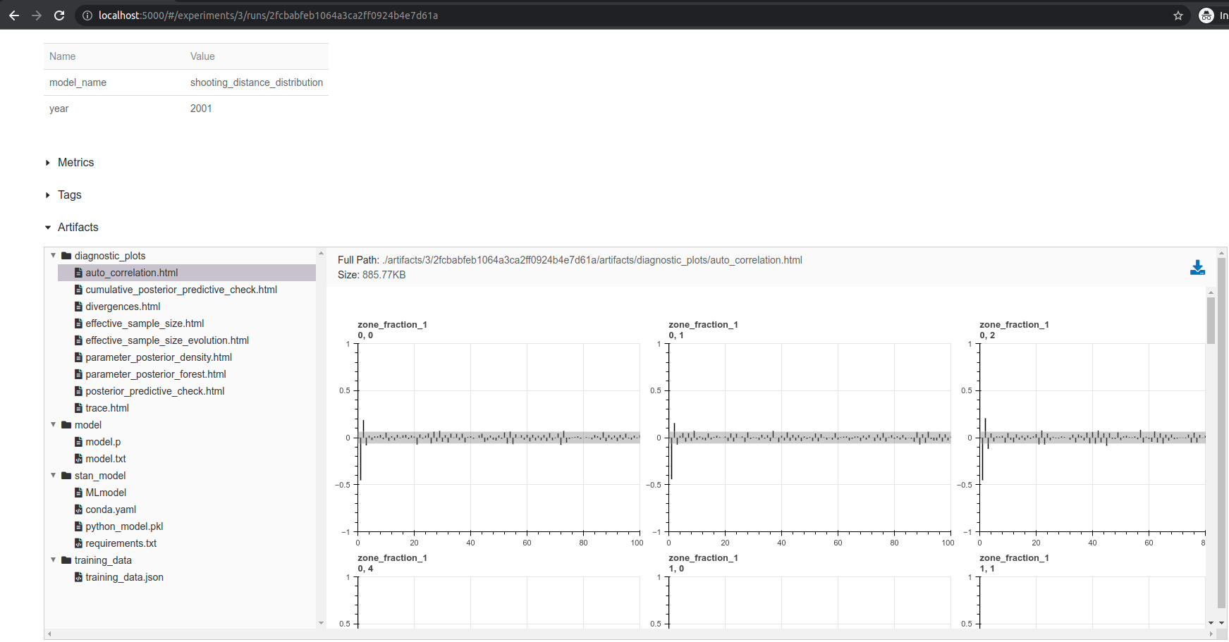
My models were getting out of hand. I had directory after directory that looked like this:

I spent 20+ hours last weekend engineering a system to keep track of experiments, organize models, automatically diagnose model fit problems, and display everything in a UI.
I want to write up my design decisions and workflow. I understand this is outside the scope of what you signed up for, so if you would rather I stick to the usual models, please reach out.
This is great! Would definitely be interested in a posts about design and workflow.
Any idea what is behind the (as you note small, but notable 2010 3-10 FT jump across all positions? I’m not sure what the story is for the PF line in that figure, but it’s intriguing!